
Modern Photo Gallery
Elegant, Responsive Image Showcase Built with React
 Preview Site
M
o
d
e
r
n
P
h
o
t
o
G
a
l
l
e
r
y
Elegant, Responsive Image Showcase Built with React
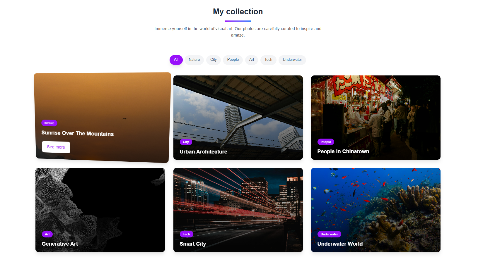
Project Overview
A sleek, responsive photo gallery built with a modern aesthetic. This project showcases optimized image loading, smooth transitions, and an intuitive lightbox experience. Designed for photographers, designers, and anyone looking to present visual content with clarity and elegance.
Key Features
- Responsive grid layout with adaptive columns
- Hover effects for image preview highlight
- Lightbox-style modal viewer with transitions
- Keyboard navigation for modal control
- Lazy loading for improved performance
- Next.js image optimization for faster load times
- Dark/light mode support
- Framer Motion-powered UI animations
- Minimalist, distraction-free interface
- Image aspect ratio consistency
- Accessible via keyboard and screen readers
Tech Stack
Next.js
Enables fast page rendering and built-in image optimization for better performance and SEO.
React
JavaScript library used to build interactive and modular components for the gallery layout and lightbox experience.
Tailwind CSS
Used to rapidly style the grid layout and create a clean, responsive design system.
Framer Motion
Adds smooth animations and transitions between gallery views and modal states.
Hashnode & Code
  import InteractiveGalleryNavigator from '@/components/InteractiveGalleryNavigator';

  export default function HomePage() {
    const galleryItems = [
      { id: 1, title: "Sunrise", image: "sunrise.jpg", category: "Nature" },
      { id: 2, title: "Urban Life", image: "city.jpg", category: "City" },
      { id: 3, title: "Chinatown", image: "chinatown.jpg", category: "People" },
    ];

  const categories = ["Nature", "City", "People", "Tech", "Art"];

  return (
    <main className="p-6 space-y-12">
      <header className="text-center">
        <h1 className="text-4xl font-bold">Gallery by OdynDev</h1>
        <p className="text-gray-600 mt-2">Explore categories and images from around the world.</p>
      </header>

      <section>
        <h2 className="text-2xl font-semibold mb-4">Categories</h2>
        <div className="flex flex-wrap gap-4">
          {categories.map((cat) => (
            <div key={cat} className="px-4 py-2 bg-gray-100 rounded">{cat}</div>
          ))}
        </div>
      </section>

      <section>
        <h2 className="text-2xl font-semibold mb-4">Gallery</h2>
        <InteractiveGalleryNavigator items={galleryItems} />
      </section>

      <section className="bg-blue-100 p-6 rounded-lg">
        <h2 className="text-xl font-bold mb-2">Join our newsletter</h2>
        <div className="flex flex-col sm:flex-row gap-2">
          <input type="email" placeholder="Your email" className="p-2 flex-1 rounded" />
          <button className="bg-blue-500 text-white px-4 py-2 rounded">Subscribe</button>
        </div>
      </section>

      <footer className="text-center text-gray-400">
        2025 Gallery by OdynDev
      </footer>
    </main>
  );
}
Interested in This Project?
Curious how this photo gallery was put together or thinking about building something similar for your own site or portfolio? I’d be happy to chat about it, walk you through the setup, or even help you get started. Feel free to reach out or check out the code for a closer look.